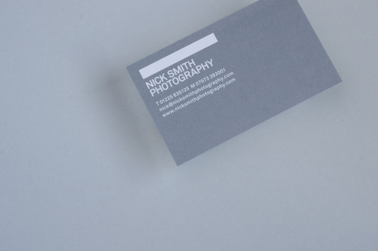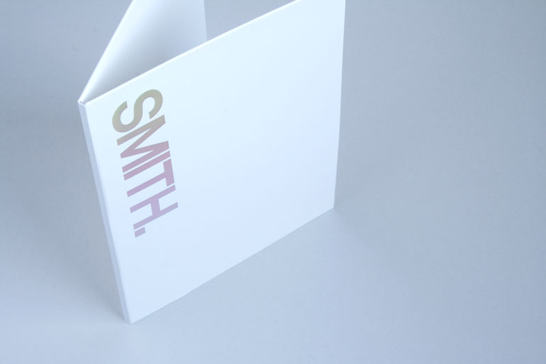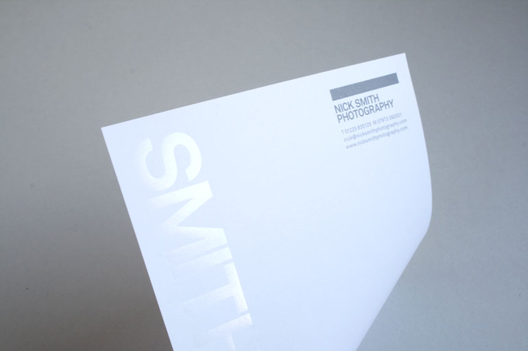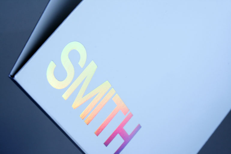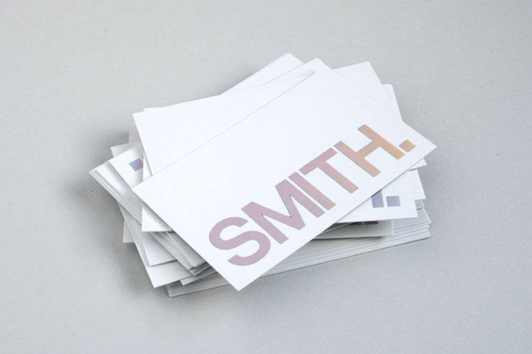
When we were asked by our friend and collaborator Nick Smith to redesign his identity and collateral, we were keen to differentiate him from the competition. Avoiding imagery that might date over time, we focused on the familiarity of the name ‘Smith’ to create a striking typographic mark which, when applied to stationery items using a variety of foils, varnishes and unusual paper stocks, ensured a memorable result whenever he used them.
Nick Smith — Photography
Details